Scan QR code or get instant email to install app

Question:
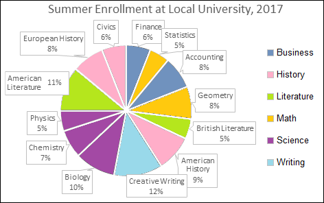
Which department has the MOST students for their summer courses in 2017?
A
History.
explanation
The departments are shown on the right of the chart. The history classes are marked in pink, and so you can add up the three classes marked with pink (European History, Civics, American History): 8% + 6% + 9% = 23%
After adding up all departments you will see that history has the highest percentage. The next highest is science, at 22%.
Take more free practice tests for other TEAS topics with our teas practice test now!
Related Information
Comments
Bebe____
4 years ago
I think this is a good app to use to review for the ATI TEAS.
CupcakeTurner
4 years ago
I feel confident that adding this app to my studying regimen will enable me to score well on the TEAS.
Shelly84852
4 years ago
This app is great practice.